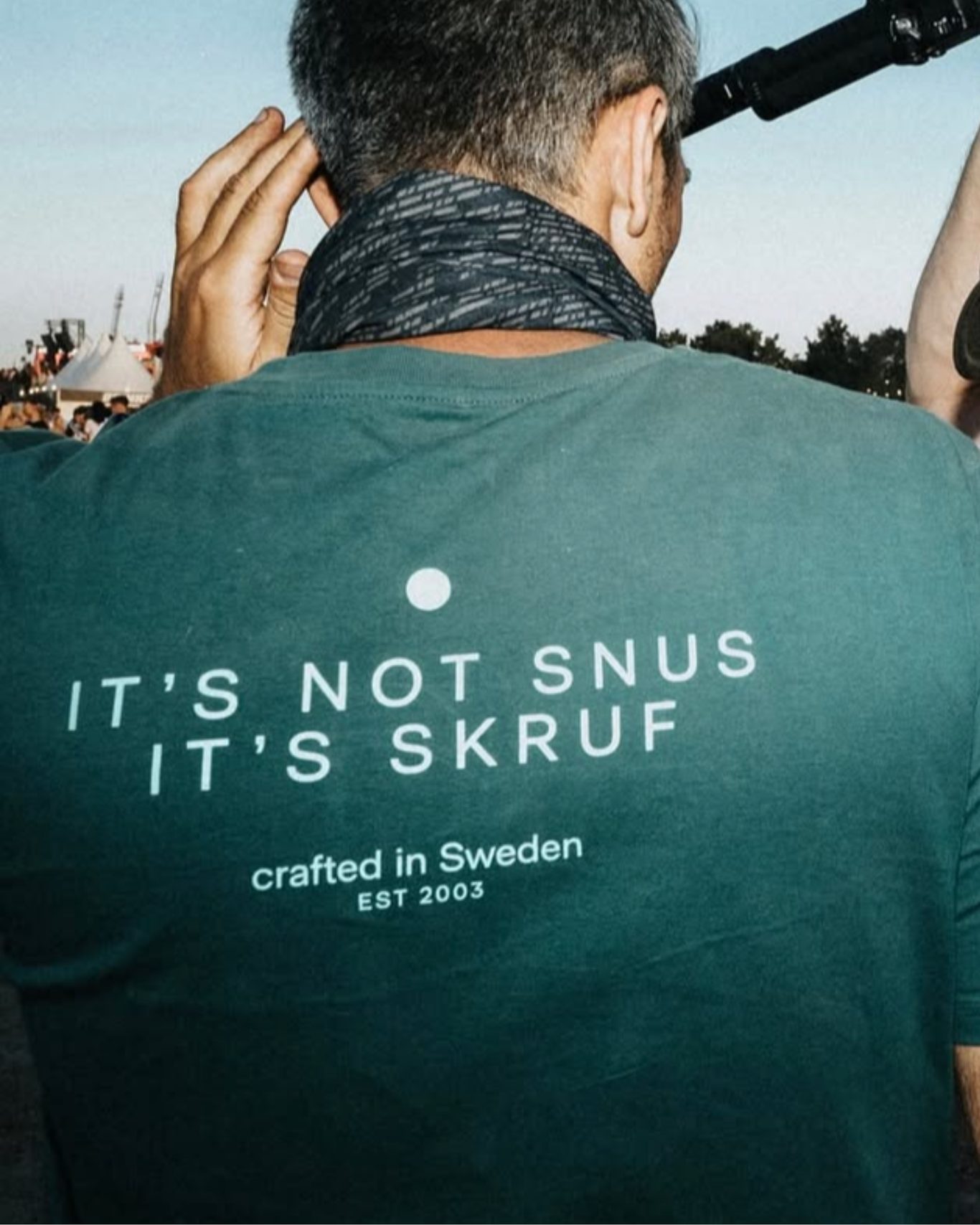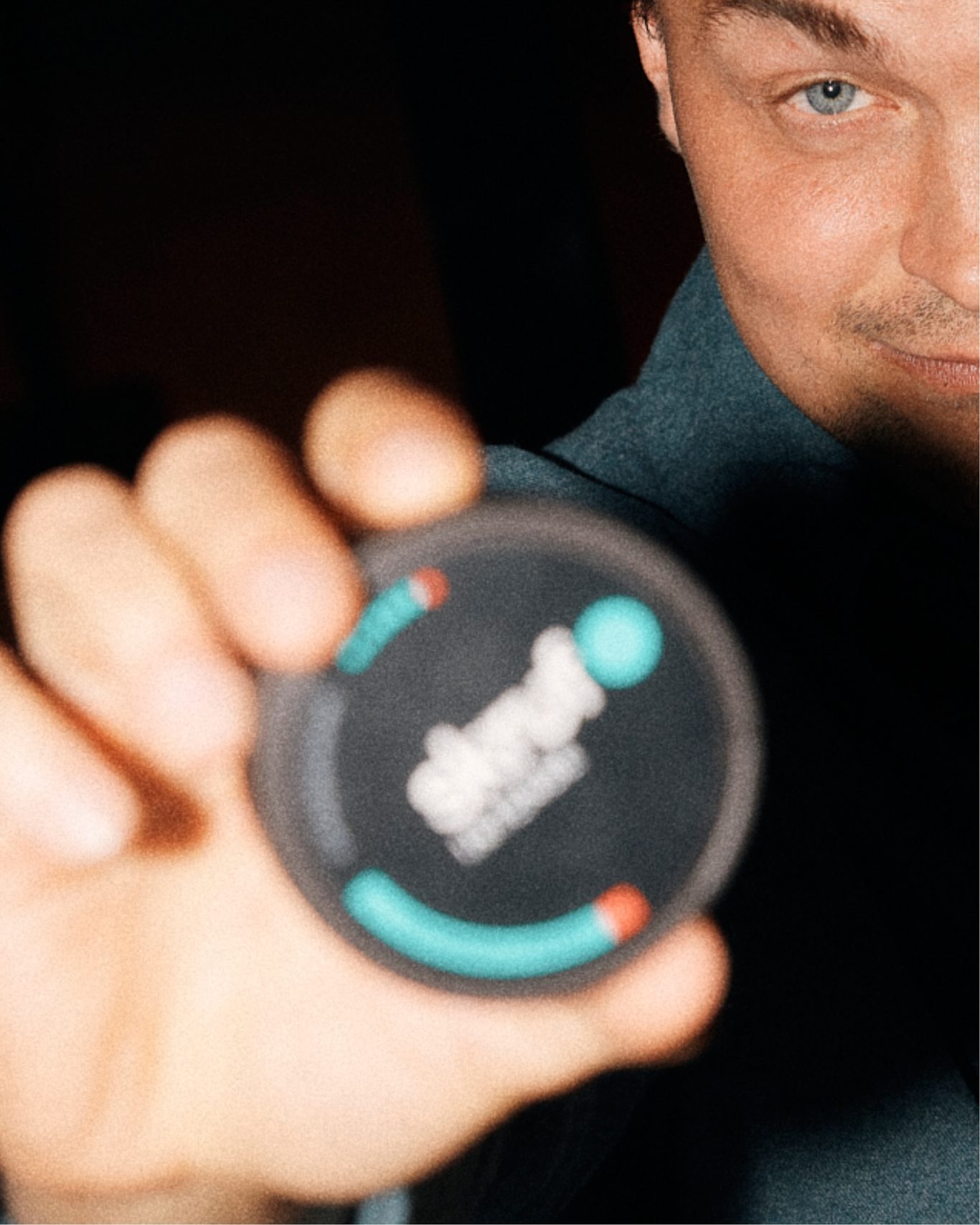


Empowering brand equity through re-design. Skruf grew from a Swedish snus brand into a global player. Then the game changed.
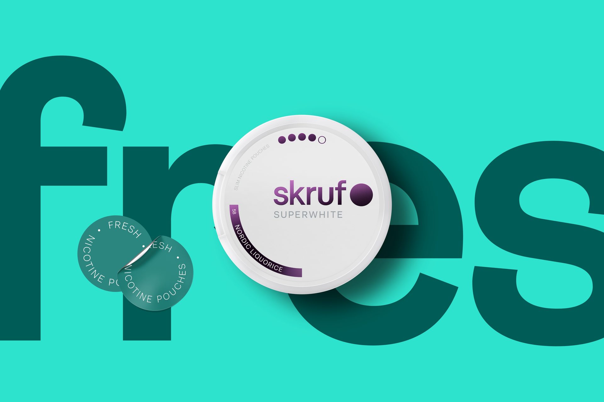
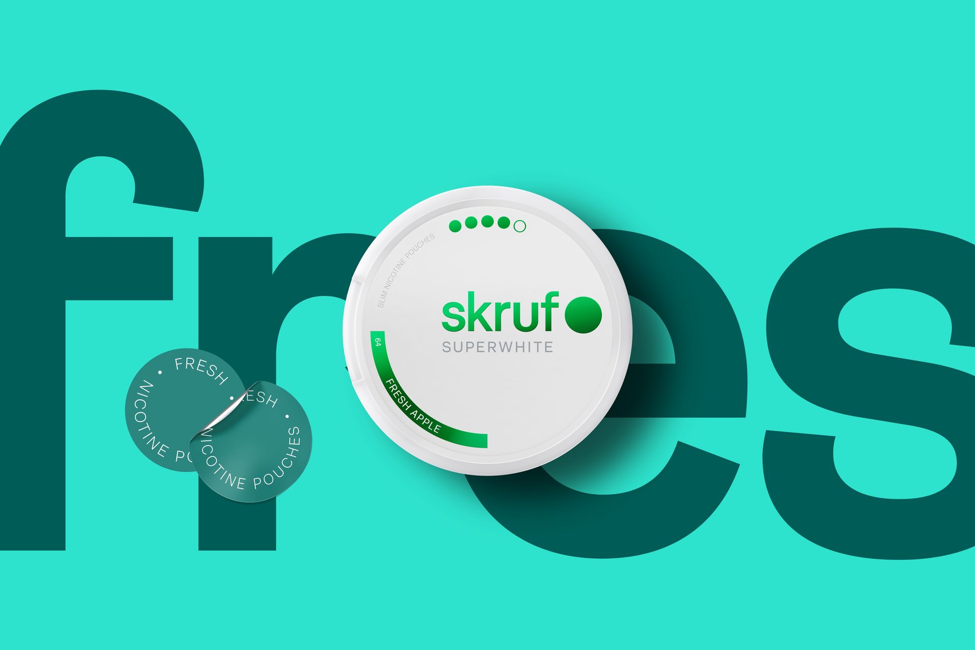
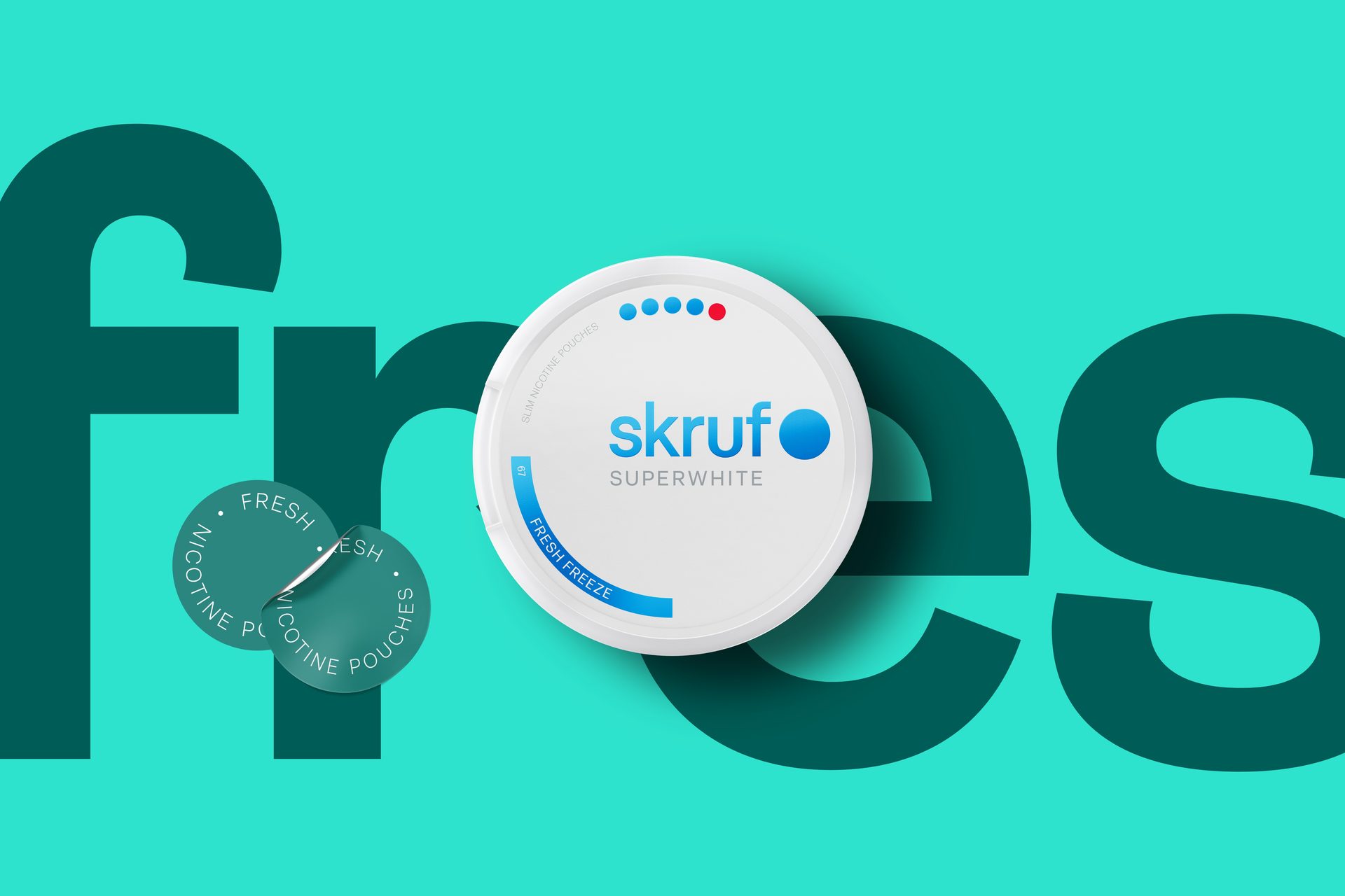
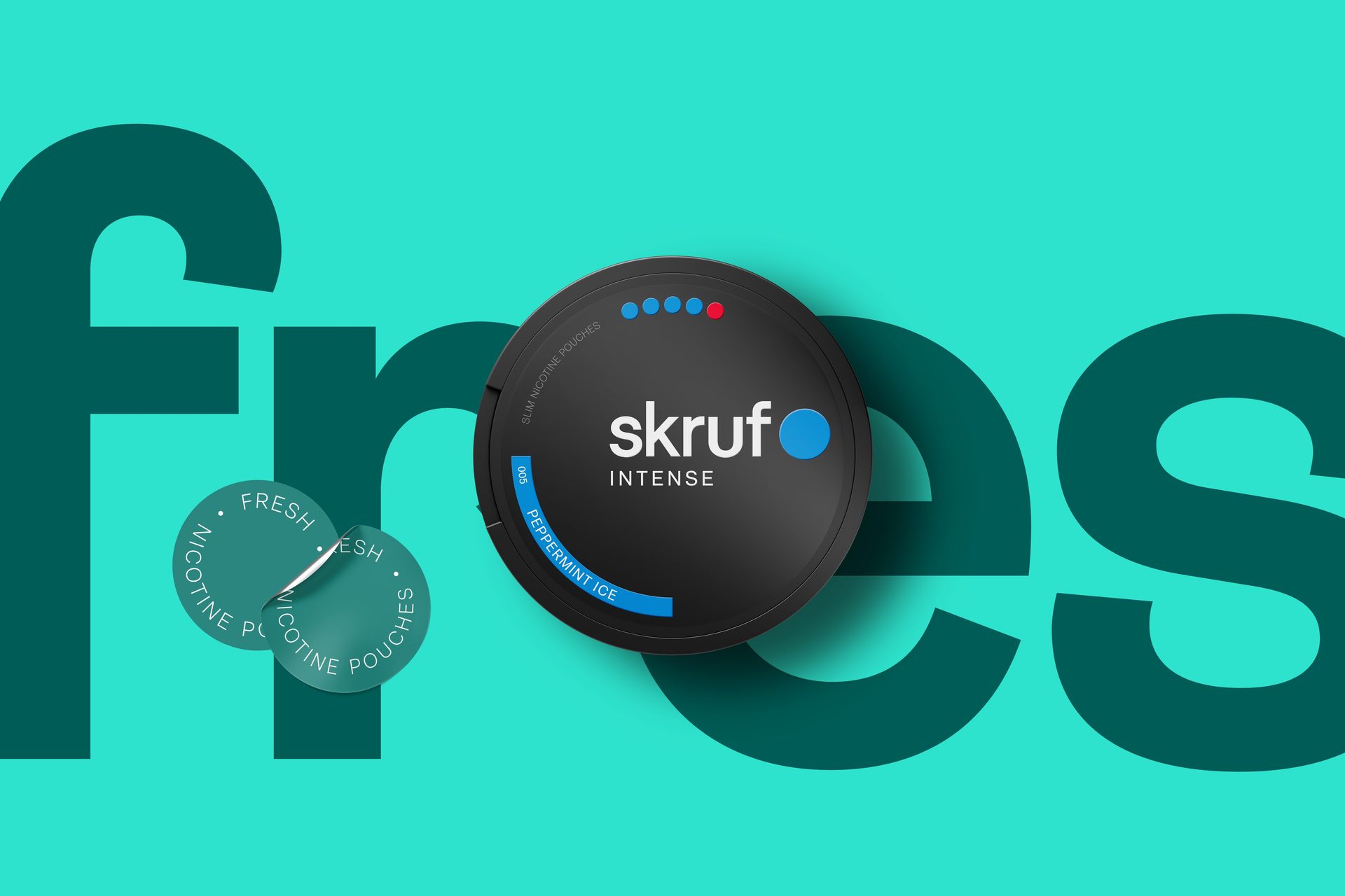
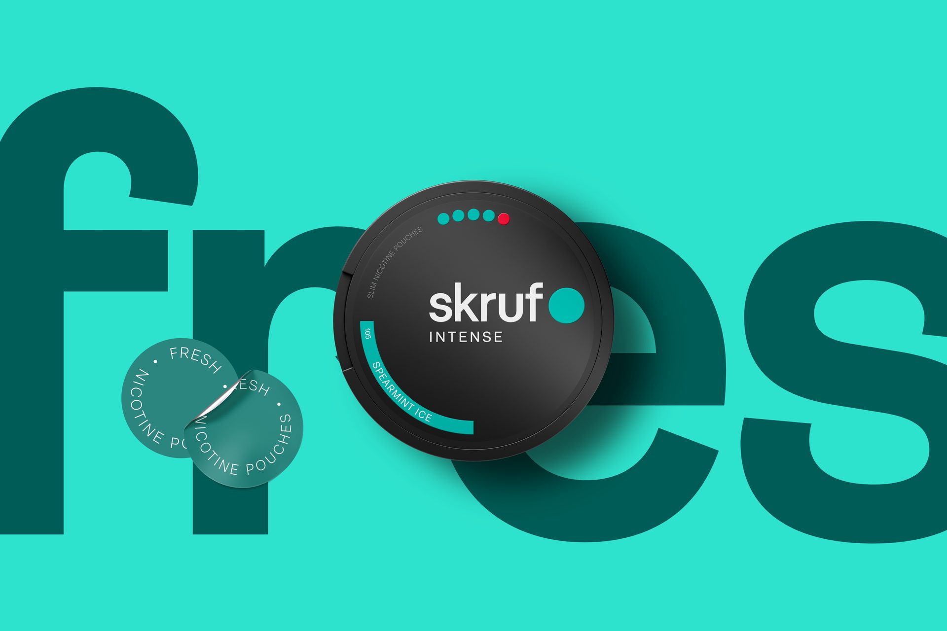
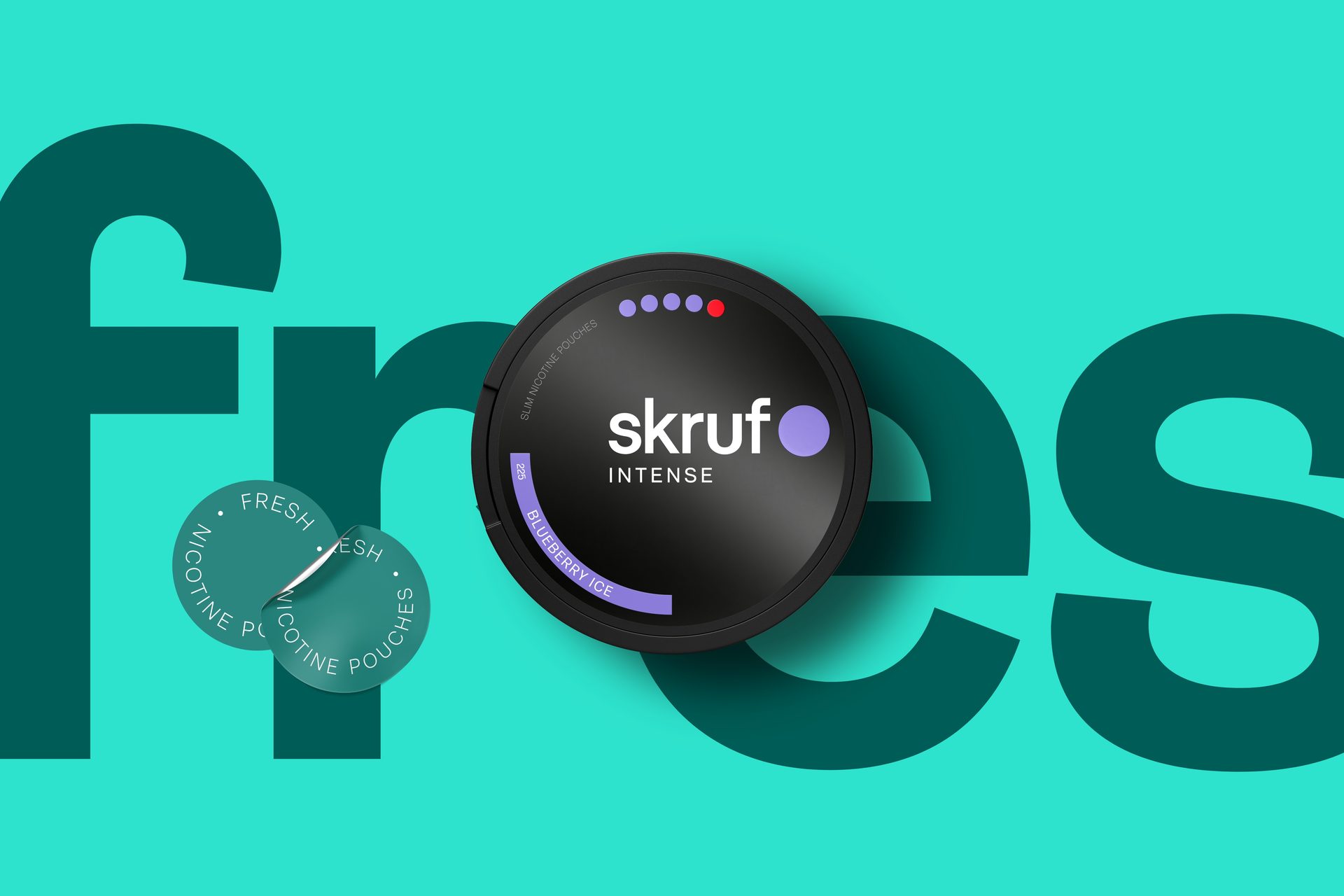
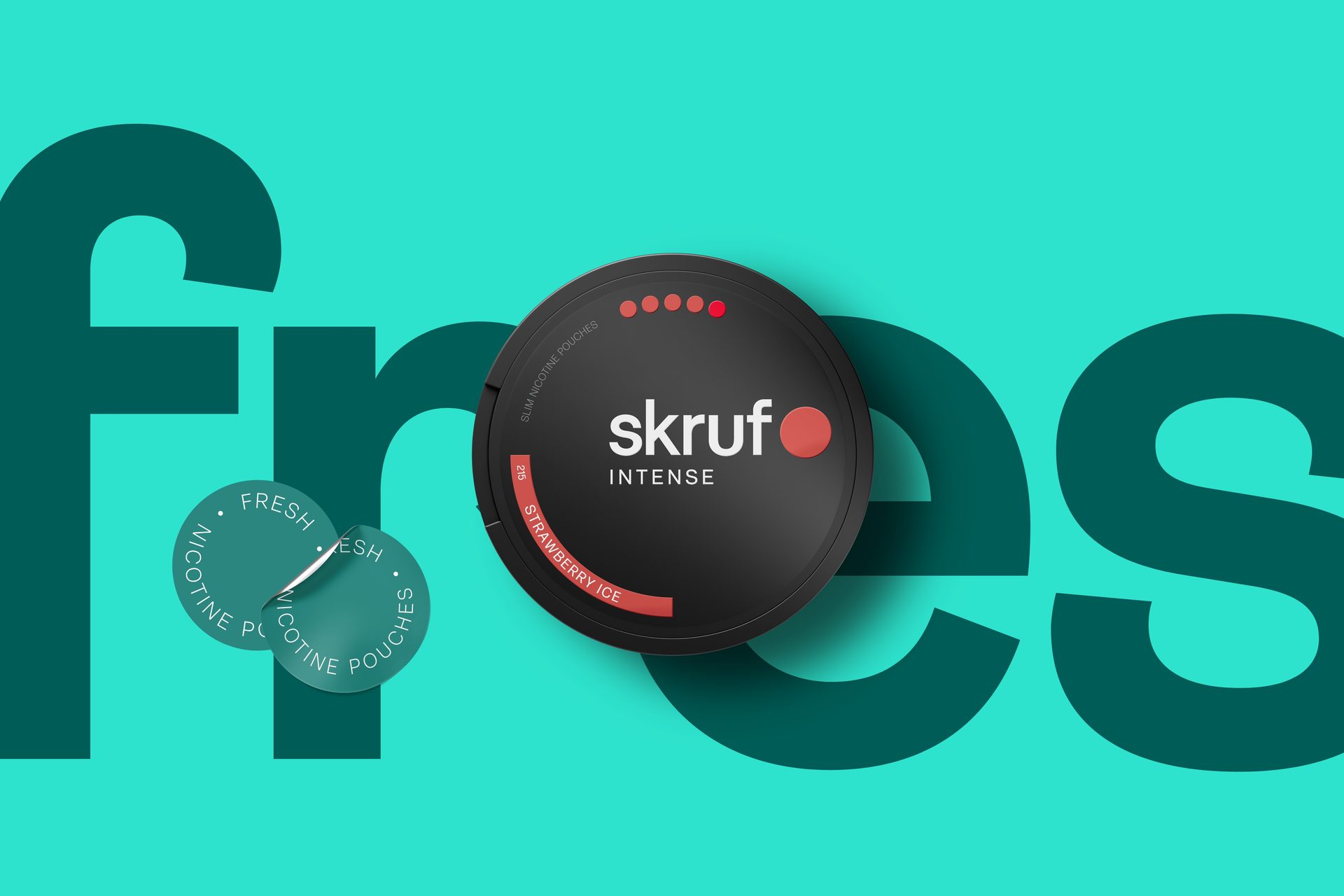
Tobacco-free snus, or modern oral nicotine (MOND), opened a new category with new competitors. To keep growing, Skruf had to win over existing customers even more and challenge the competition head-on.
The challenge was just as much about consistency. Skruf sells in markets with very different regulations, and the brand needed to look and feel like one brand everywhere, yet stay flexible enough to adapt locally when the rules demand it.


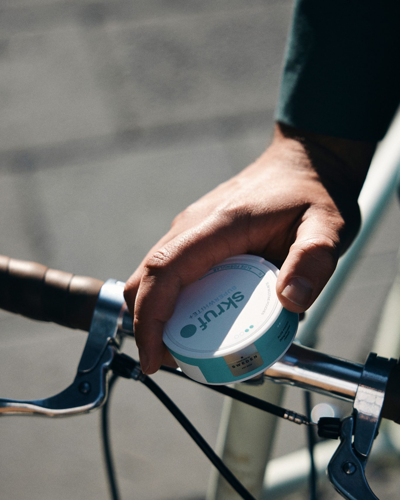
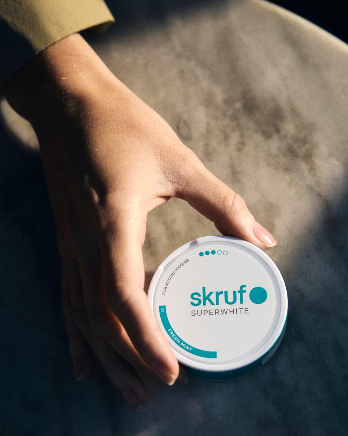
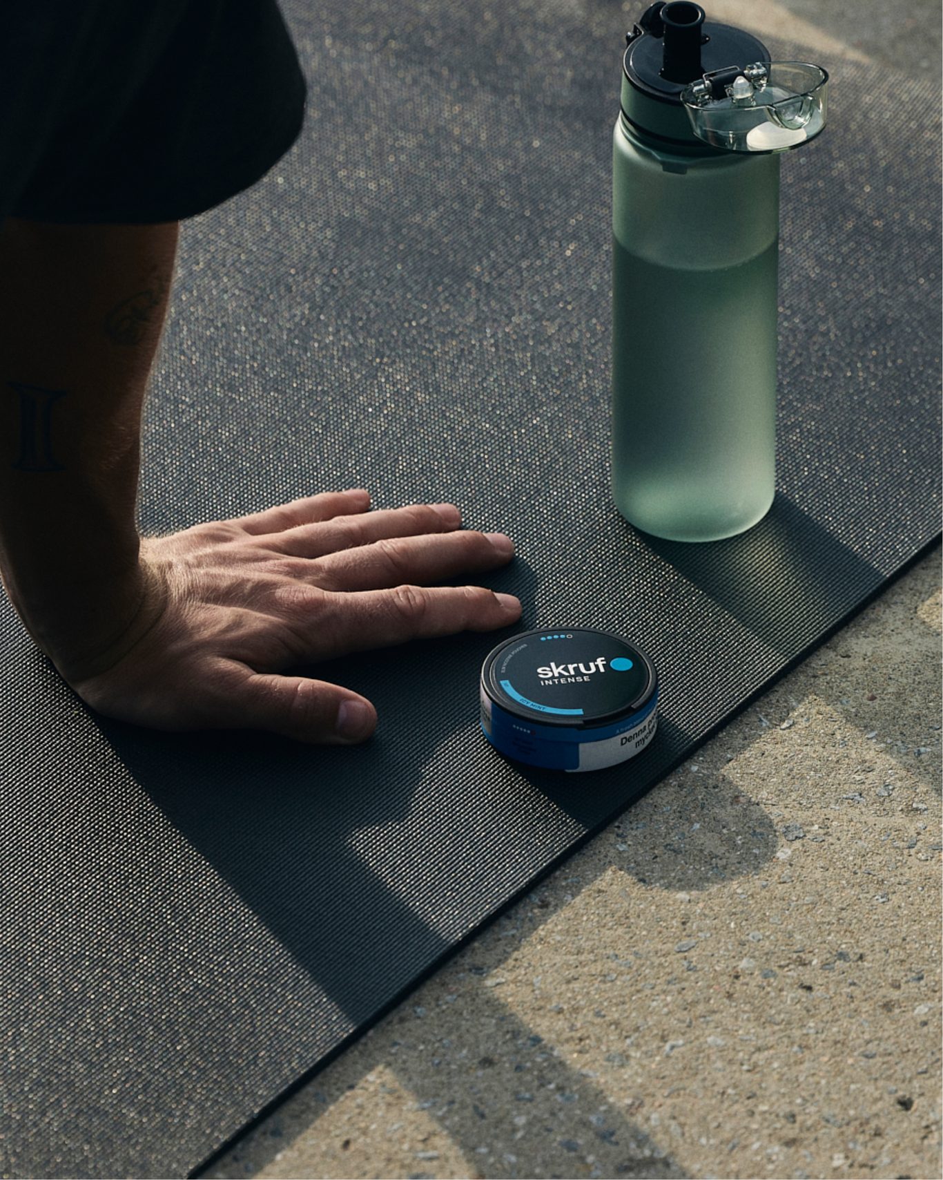
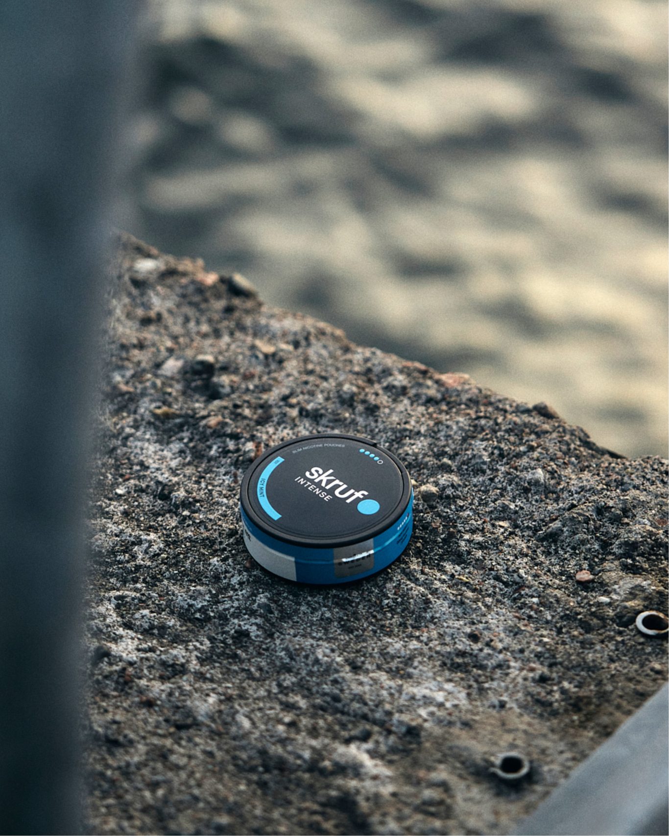
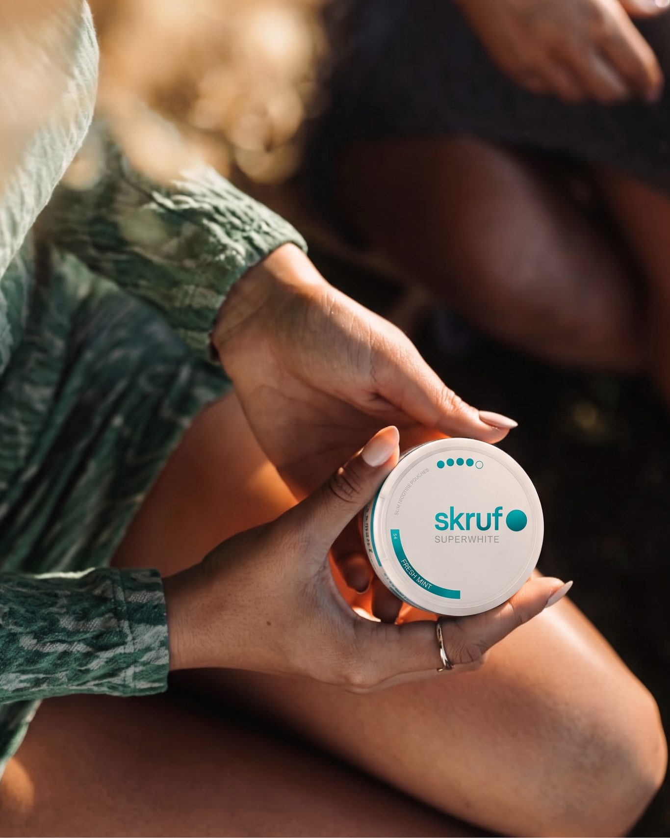
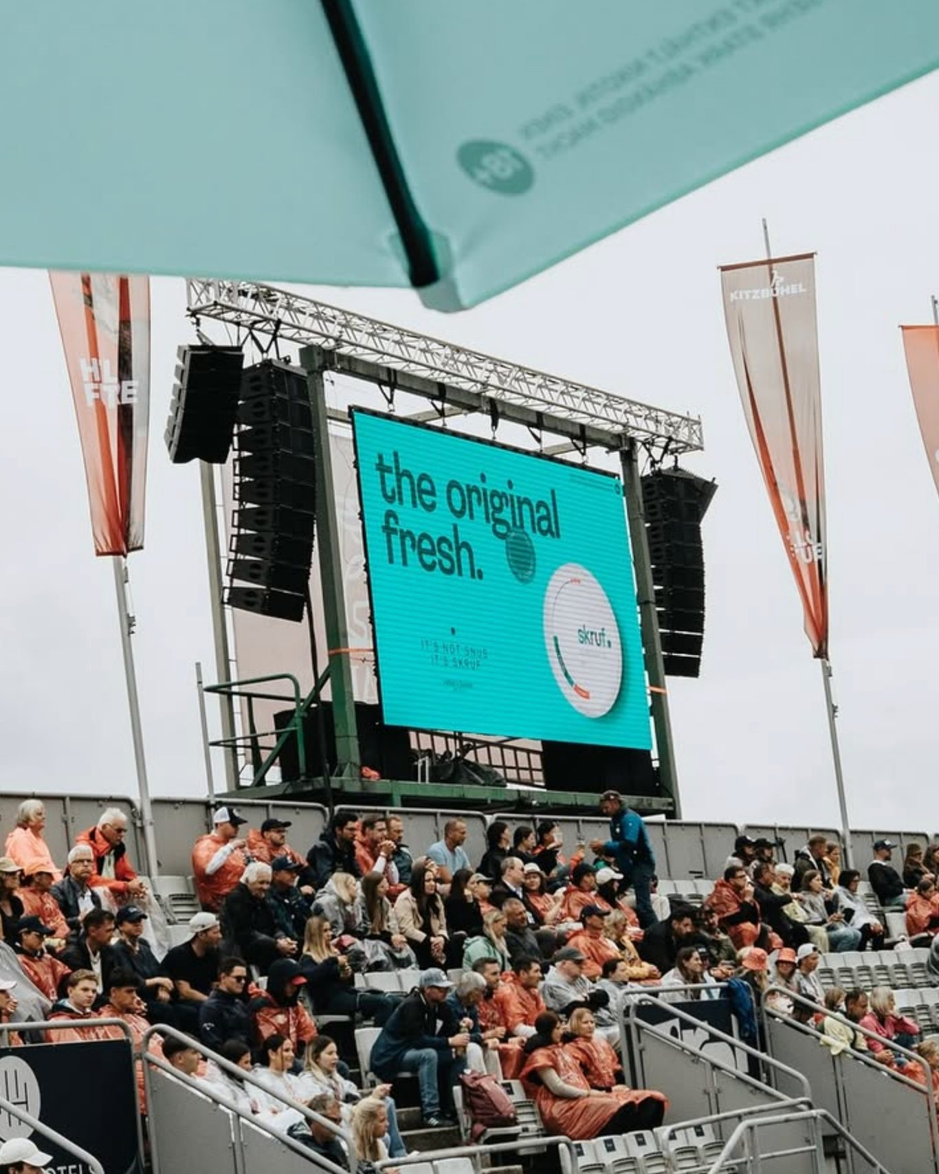
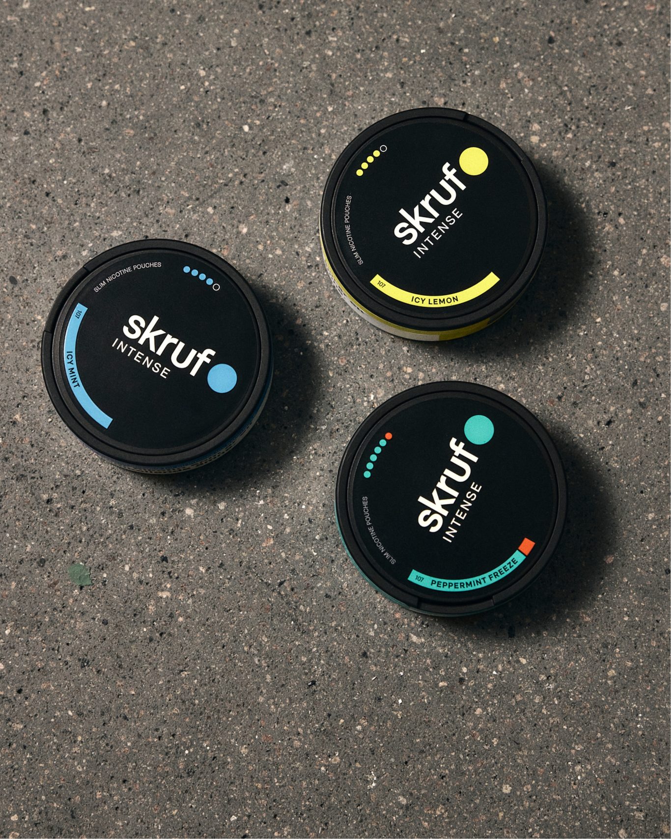
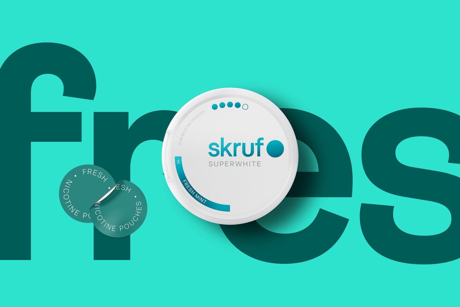
Our answer was to modernise the packaging of Skruf’s two brands, INTENSE and SUPERWHITE+, and to build the position that runs through everything we do for Skruf: The Original Fresh.
We created a global, functional design system for the entire MOND category. In the re-branding of the two brands, we explored and developed conceptual master key visuals for research, and produced launch toolkits, PoS and marketing material.


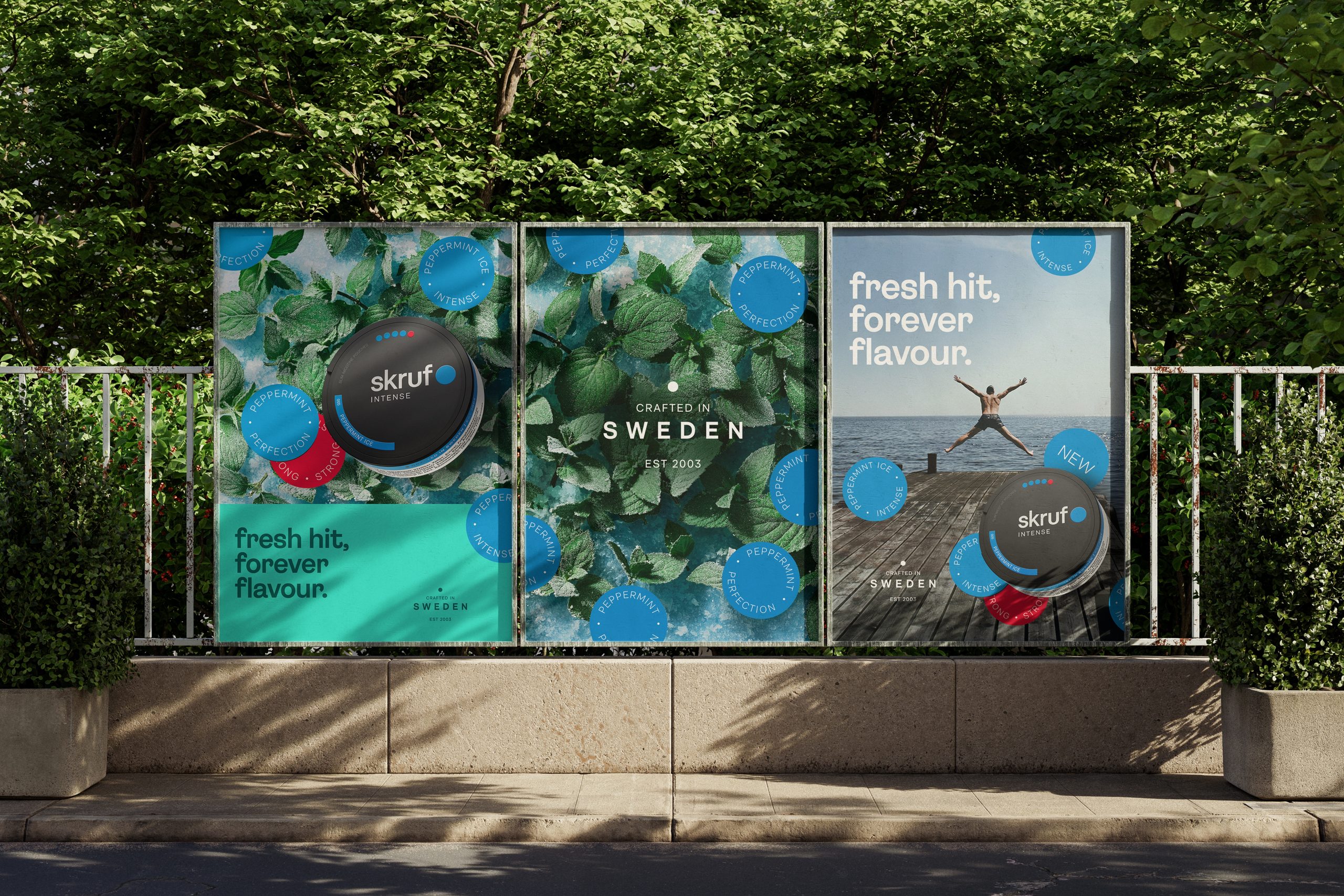
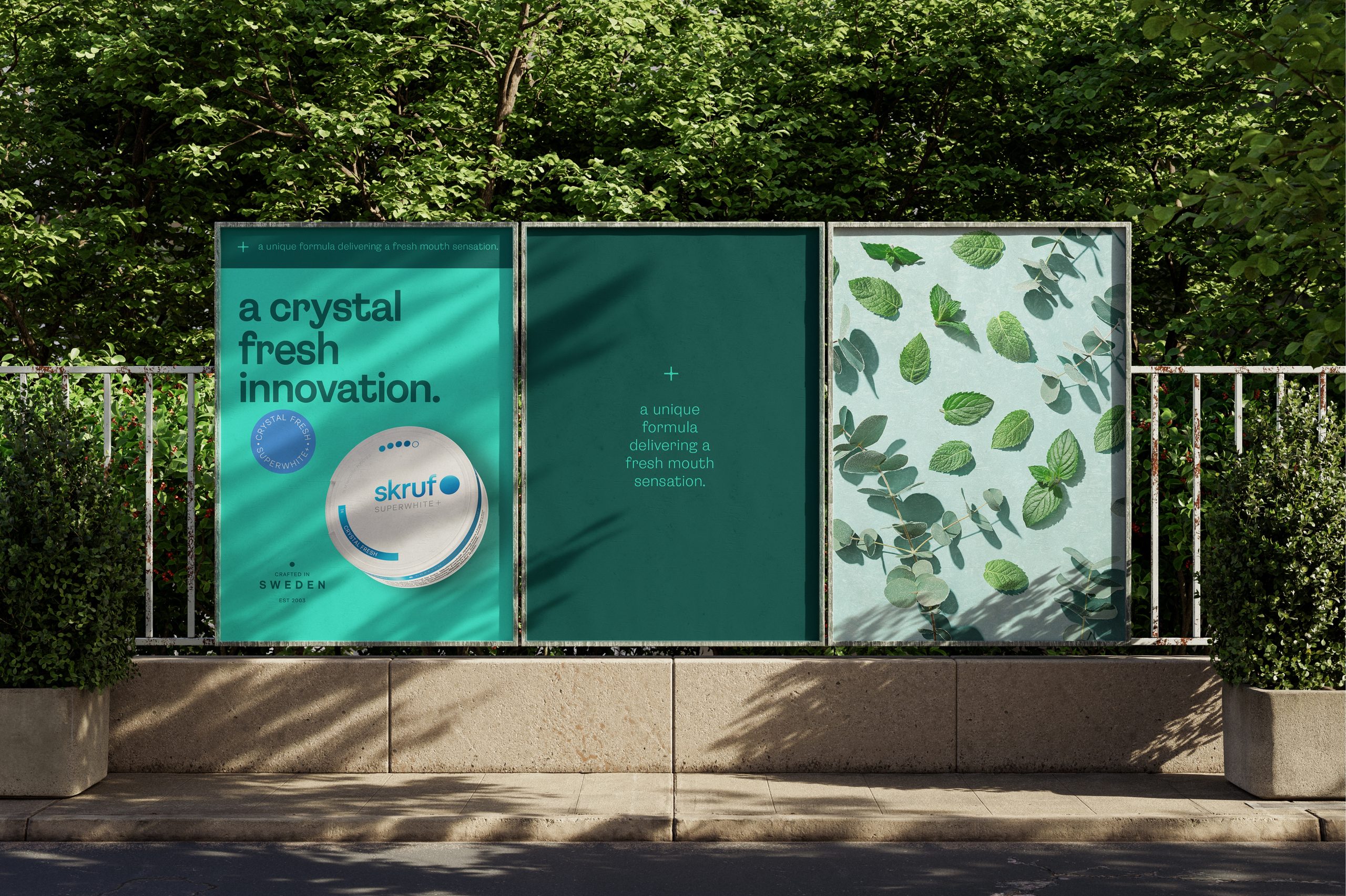
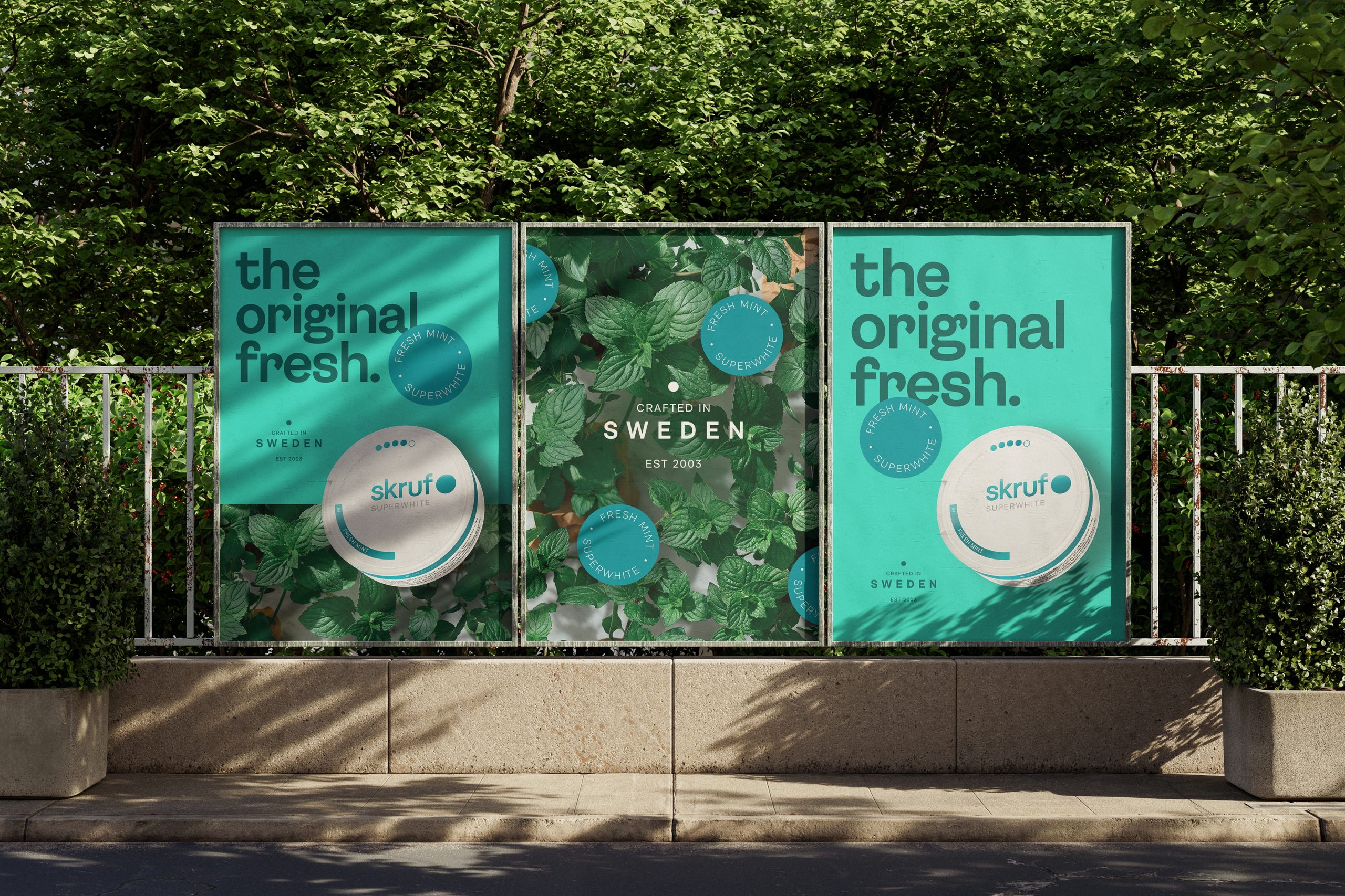


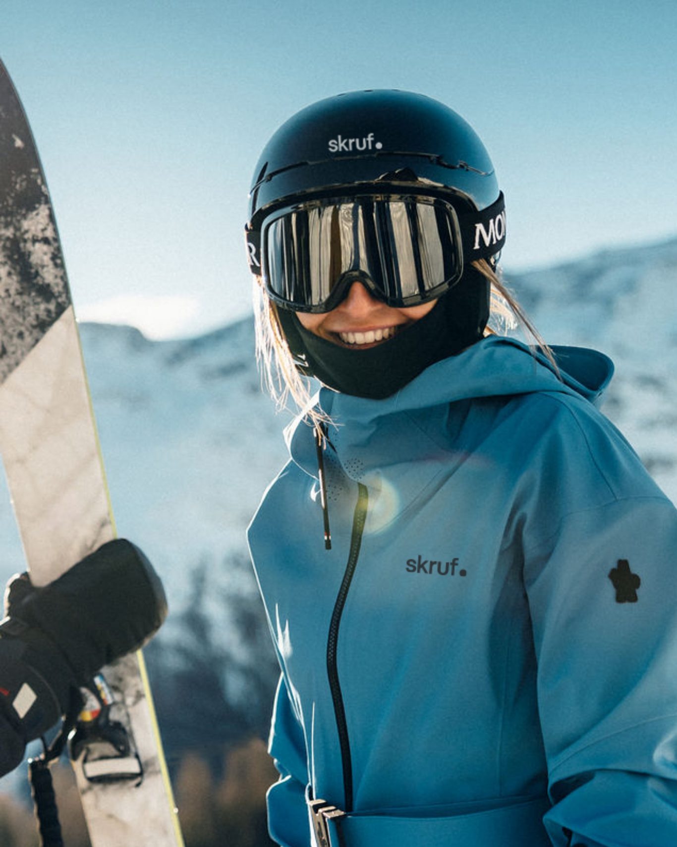
The result is a clear and well-defined design system that lets Skruf adapt its products to every market with both consistency and efficiency. We develop the ideas, lead the creative process, and create toolkits and guidelines for internal stakeholders and B2B clients. For the Austrian market, we have taken the work all the way: from idea and creative lead to toolkits and guidelines, and implementation across indoor and outdoor stores.